Employer
acquired by JP Morgan Chase
Aumni is a portfolio management platform used by venture firms, law firms, and limited partners to manage investments, analyze trends, and benchmark performance in the private market.
Role
Strategy, Product Management, Research and Design
Team Members
Lead Frontend Architect
Frontend Engineers
QA Engineers
Engineering Manager
Subject Matter Experts
Duration
Dec 2023 - April 2024
Challenge
Limited design resources led to deprioritized design system work, resulting in tech debt, misalignment with engineering, unmet accessibility standards, and inconsistent user experiences.
Solution
A revamped design system, now called ARC (Aumni Reusable Components), introduces an improved foundational layer of clearer contribution guidelines, shared language between design and engineering, and flexible, reusable components to better support both current and future product needs.
Outcomes
🌈
🧩
Read Case Study
Background
In early 2020, I took on the challenge of designing and implementing Aumni’s first design system. Working closely with a few frontend developers, we laid the foundational layer by designing and building components, defining processes, and striving to bring consistency to a fast-moving organization. As the primary design point of contact, I balanced maintaining the design system while contributing across multiple product squads, though competing priorities often meant the design system needs took a back seat.
When Aumni was acquired by JP Morgan on 2023, it marked a pivotal moment. I shifted my focus on the frontend squad, partnering more closely with engineering to redesign our design system. I tackled longstanding design system challenges, took on product management responsibilities, and helped build the system for the future as the company entered a new phase of rapid growth.
A Time for Reflection
With the frontend base team, I led a brainstorming session to evaluate our current design system. The session focused on identifying what was working well, areas for improvement, and knowledge sharing, highlighting both developers and designers experiences.
As a result of this session, we identified three key problem statements and began ideating potential solutions, sparking meaningful discussions and setting the stage for actionable next steps.
Problem Statement #1
The lack of a fully developed and established philosophical and foundational layer in the design system impacts its potential for success and long-term viability.
Problem Statement #2
Unclear processes and governance leads to unregulated and unusable contributions to the design system.
Problem Statement #3
The lack of documentation leads to uncertainty regarding the usage or existence of the various layers (foundations, token, core system and components) that make up a design system.

To see a closeup, check out my FigJam
Audit & Preparation
During a tech debt sprint, another lead designer and I led a team of designers to audit and document each component, ensuring alignment between what was available in design and what existed in Storybook and code. We found that most components lacked comprehensive documentation, meaning documentation was detailed but catered exclusively to either designers or engineers, with few components offering clear guidance for both.
Additionally, as new variants and components were added over time by both designers and developers, a disconnect emerged regarding which components were the most up-to-date. This misalignment led to confusion about which components to use and the reasoning behind those choices.
A Designer’s Pulse Survey
I drafted and distributed a pulse survey to product designers to evaluate the strengths and weaknesses of the design system, which provided valuable insights to identify and prioritize areas for improvement. The survey revealed several key areas of concern:
75%
of designers reported detaching components because they felt constrained by existing ones that didn’t meet their needs.
50%
expressed uncertainty about the contribution process, highlighting a lack of clarity in how to contribute to the design system.
50%
indicated a need for better documentation to understand when to use which component and/or property and why.
These insights highlighted the critical need to address these pain points to improve the usability and effectiveness of the design system from a designer’s perspective. It also reinforced the problem statements developed during the brainstorming session, providing additional clarity and focus for prioritization.
Guiding Design System Principles
After many rounds of brainstorming with the lead frontend architect and reviews with the design team and frontend base team, we established a set of principles. These principles help guide designers, developers, and everyone else in the organization to make decisions with shared purpose, clarity, and consistency.
Accessibility
ARC ensures that our interfaces are human and accessible to a broad audience. We strive to enable all individuals with diverse needs and circumstances to use our product.
Collaboration
ARC fosters collaboration through a shared language and shared patterns, which streamline workflows through delivery for both designers and developers.
Simplicity
ARC provides clarity by reducing complexity in the product development process and user experience.
Refactoring the Color System
The original color system worked for a smaller team and product, but as needs grew, its rigid structure, unclear naming, and lack of accessibility became limiting. Designers and developers began adding ad hoc colors, resulting in a bloated and inconsistent system. I partnered with another designer focused on accessibility to lead a color revamp. Through a design team color workshop and stakeholder reviews, we created a flexible, accessible system with clear naming and token-based structure, leveraging Figma’s new token feature.
Primitive Colors
Designed a color system with intuitive naming conventions and accessible contrast ratios
Color Roles
Text Palette
Primary
Grey 950
Secondary
Grey 800
Tertiary
Grey 600
Primary
Grey 0
Secondary
Grey 400
Tertiary
Grey 500
Inverted Text Palette
Light
Grey 50
Dark
Grey 900
Background UI
Default
Blue 400
Weakest
Blue 50
Informational
Default
Red 400
Weakest
Red 50
Urgent
Default
Green 400
Weakest
Green 50
Success
Warning
Default
Orange 400
Weakest
Orange 50
A high-level view of some assigned color roles for a token-based foundation
Key Functionalities
Using Design Tokens
When Figma introduced its variables feature, we transitioned from styles to design tokens. This shift helped align our design system more closely with our code and Storybook implementation, while providing better clarity around color and spacing usage across the app. This allows us to track and update any color or spacing easily. We designed the tokens to represent fundamental decisions with predictable and clear intended usage. Here's how we structured our naming conventions:
Type: color, size, spacing
Category: background, font-size, radius, border
Instance: warning, error, success
Emphasis: strongest, stronger, strong, default, weak, weaker, weakest
Variant: primary, secondary, tertiary
State: resting, focus, hover, selected, disabled, in-range (for inputs), pressing/active
Establishing a System of Governance
While about half of designers and developers understood the design system's contribution process, this level of clarity wasn't good enough. We aimed for the process to be crystal clear and truly collaborative. After all, the design system isn’t controlled solely by the frontend base squad, it is a system that is continuously evolving through contributions from the entire team. Below is a high level overview of the four stage process of contributing to the ARC Design System.
Proposal
Proposals help the Design System team understand what product squads want to achieve. Before submitting a proposal, consider:
Does something similar already exist?
If so, does it fulfill the needed requirements?
If existing components meet your needs, use those. Otherwise, fill out and submit an ARC Contribution Ticket with details about your problem, proposed solution, and any relevant references. The frontend base squad reviews proposals for completeness and basic requirements.
Draft & Consideration
Once a champion is assigned, the proposer and champion work together to create a detailed specification that outlines the problem and solution. For component proposals, this includes but not limited to defining the API, required attributes, visual design (rough mockups are acceptable), and component states. The proposal can only advance when there is clear agreement on how it will be implemented in both code and design.
Implementation & Review
The proposal is built in code and Figma, with tests, documentation, and proof of concept implementations. Working group members review these POCs to validate functionality and edge cases. The implementation must meet all requirements for accessibility, responsiveness, themes, and browser support.
A rollout plan is created at this stage, including any needed deprecation plans for existing components.
Release
Once all requirements are met with no issues, the proposal is considered complete, released, and ready for widespread use within the design system. Any future changes would require a new proposal.
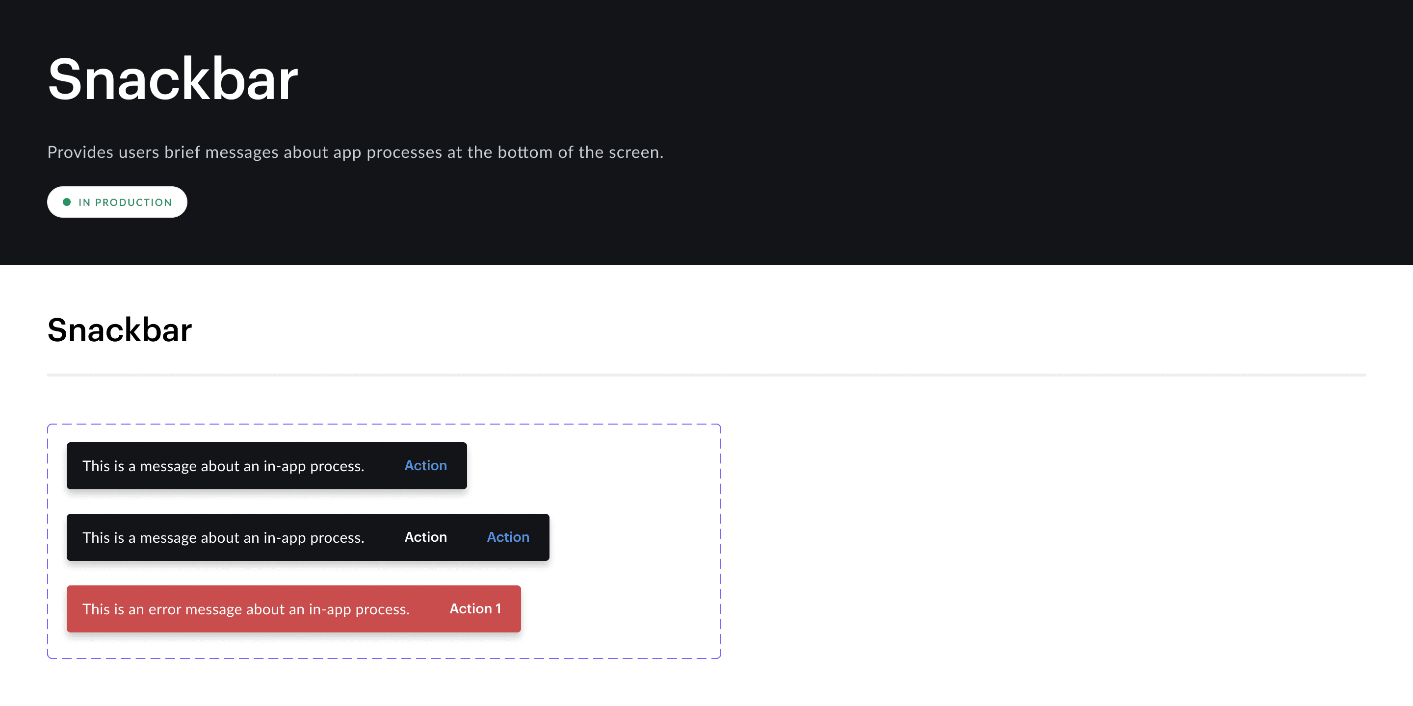
Refactoring Components for More Flexibility
Following a component library audit, we partnered with the frontend base team to quickly refactor easy fixes through pairing sessions. Feedback from the pulse survey and Figma analytics showed designers often detached components due to limited flexibility. To address this, I introduced slot components, an approach from Figma Config 2023, that allowed flexible content changes within components while maintaining structural integrity. This was especially effective for components with evolving or uncertain variations.
Reflection
Although I decided to leave Aumni/JPM before the full implementation of the ARC design system, early rollouts showed strong adoption and traction. Feedback from designers and developers confirmed the system’s value, not only in improving product consistency, but also in enhancing team efficiency, cross-functional alignment, and scalability.